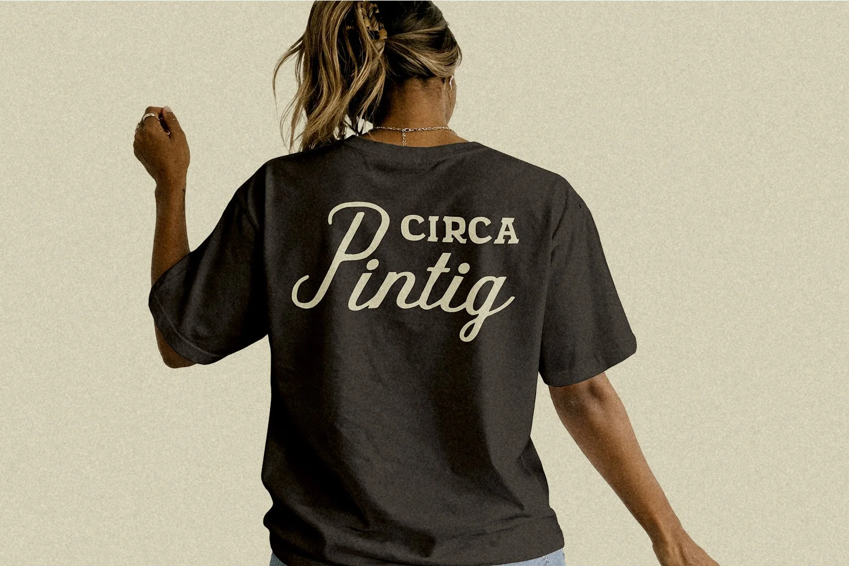
CIRCA Pintig / Chicago, IL / 2026 Selected to rebrand CIRCA Pintig, a Chicago-based Filipino American theater and community arts company. The organization focuses on “empowering immigrant communities through the arts, music, education, and service.”
CreditClient: CIRCA Pintig
Industry: Nonprofit Arts Organization
Role: Identity Rebrand, Style Guide, Social Media Templates.
History & Creative Brief
As a cornerstone of Chicago's Filipino American performing arts for 34 years, CIRCA Pintig has continually delivered community-driven productions that spark reflection and engagement.
The organization’s foundations date back to the early 1980s, when its newly arrived Filipino founders channeled the support, resilience, and lived experiences of Chicago’s immigrant networks into a grassroots cultural movement. CIRCA stands for Center for Immigrant Resources and Community Arts, and the term "Pintig" translates to "heartbeat" or "pulse" in Filipino, symbolizing the vital energy the “pintig players” (theatrical ensemble) bring to the stage.
Under new artistic leadership and a fully engaged acting ensemble, CIRCA Pintig want to engage more with in the storefront theatrical landscape of Chicago by providing new works from new Filipino and Filipino American playwrights.
Brand Direction
The team wanted the new look to evoke the forward movement of the Filipino community in storytelling and performance. Evolving the current identity, it was quintessential the brand balanced:
Reclaiming and owning culture
Modern and traditional
Familiar and welcoming
Filipino American presence
Visual Identity
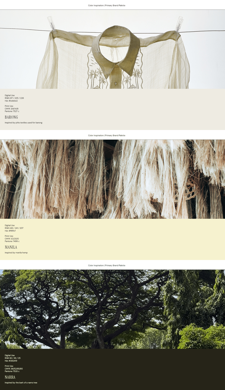
The primary brand palette includes hues that reflect the diverse Filipino textiles and textures. Barong is inspired by piña fabric, often used for embroidered dress shirts, Manila inspired by manila hemp which comes from a species of banana plant native to the Philippines, and Narra inspired by Philippines’ national tree.
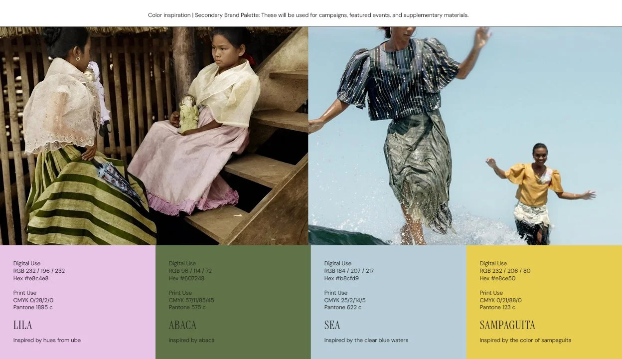
The secondary brand palette includes Lila, a light purple color inspired by the color of ube. Ube is a remarkable ingredient that put the Philippine cuisine on the map — not only in the US, but all over the world. Abacá, inspired by banana leaves, symbolizes resilience due to its tensile strength. Sea, inspired by the waters shared between the native home and new home, for many Filipino Americans. Sampaguita, inspired by the color of the Philippines’ national flower, symbolizing joy and a new dawn.
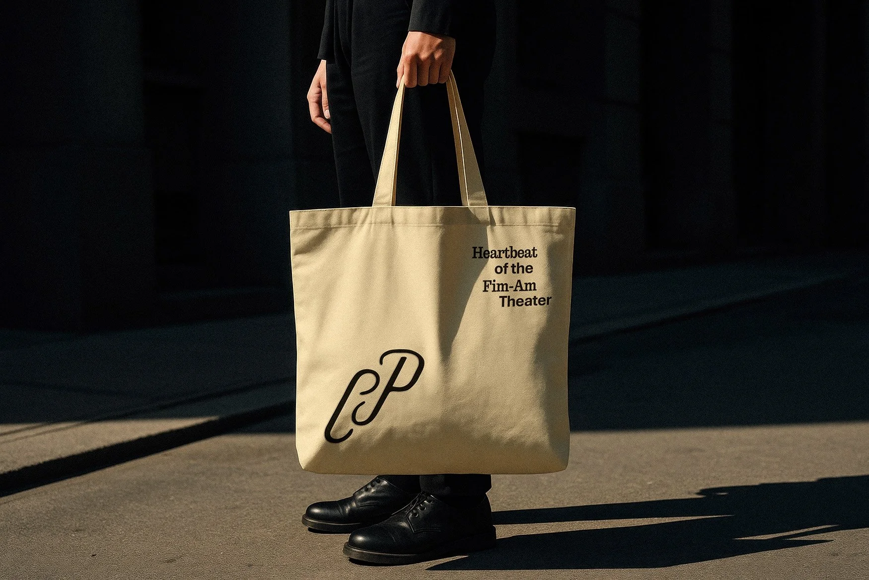
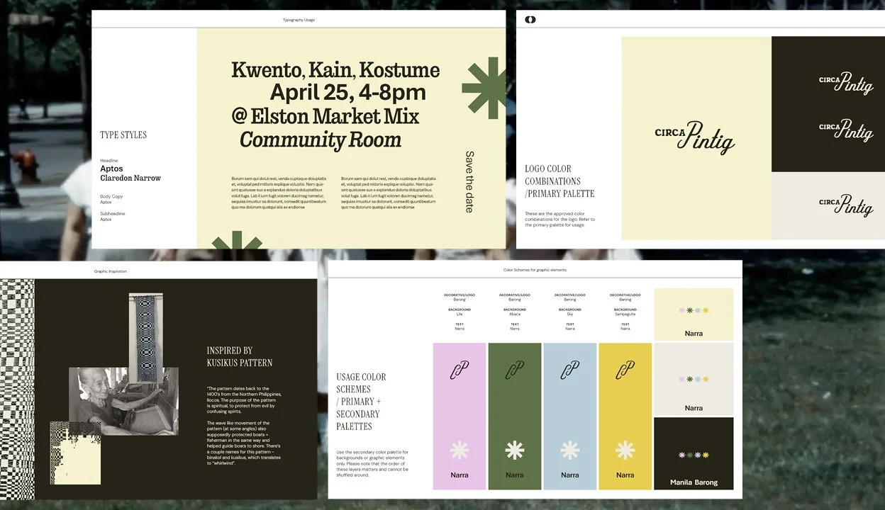
The refreshed logo incorporated two styles of type—one mimicking painted brush strokes, and the other with handwritten cursive. Unlike sans-serif types, these were intentionally selected and modified to feel nostalgic, as if painted or written by a friend or the neighborhood sign-painter.
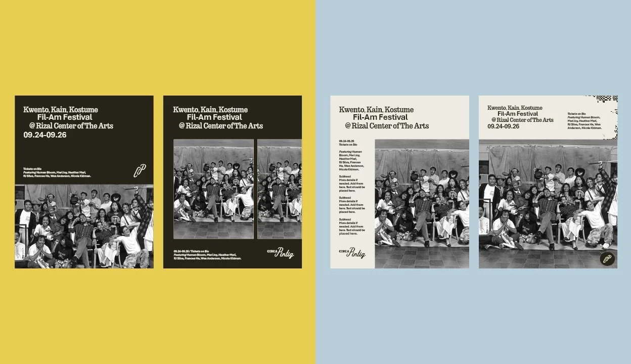
Expanding the brand outside of the logo suite, the established type system was created to help bring and editorial yet independent feel without losing functionality. Additionally, a visual system was strategized to include guidelines of usage and to support the organization’s upcoming productions, workshops, and community arts initiatives through social media and print design.