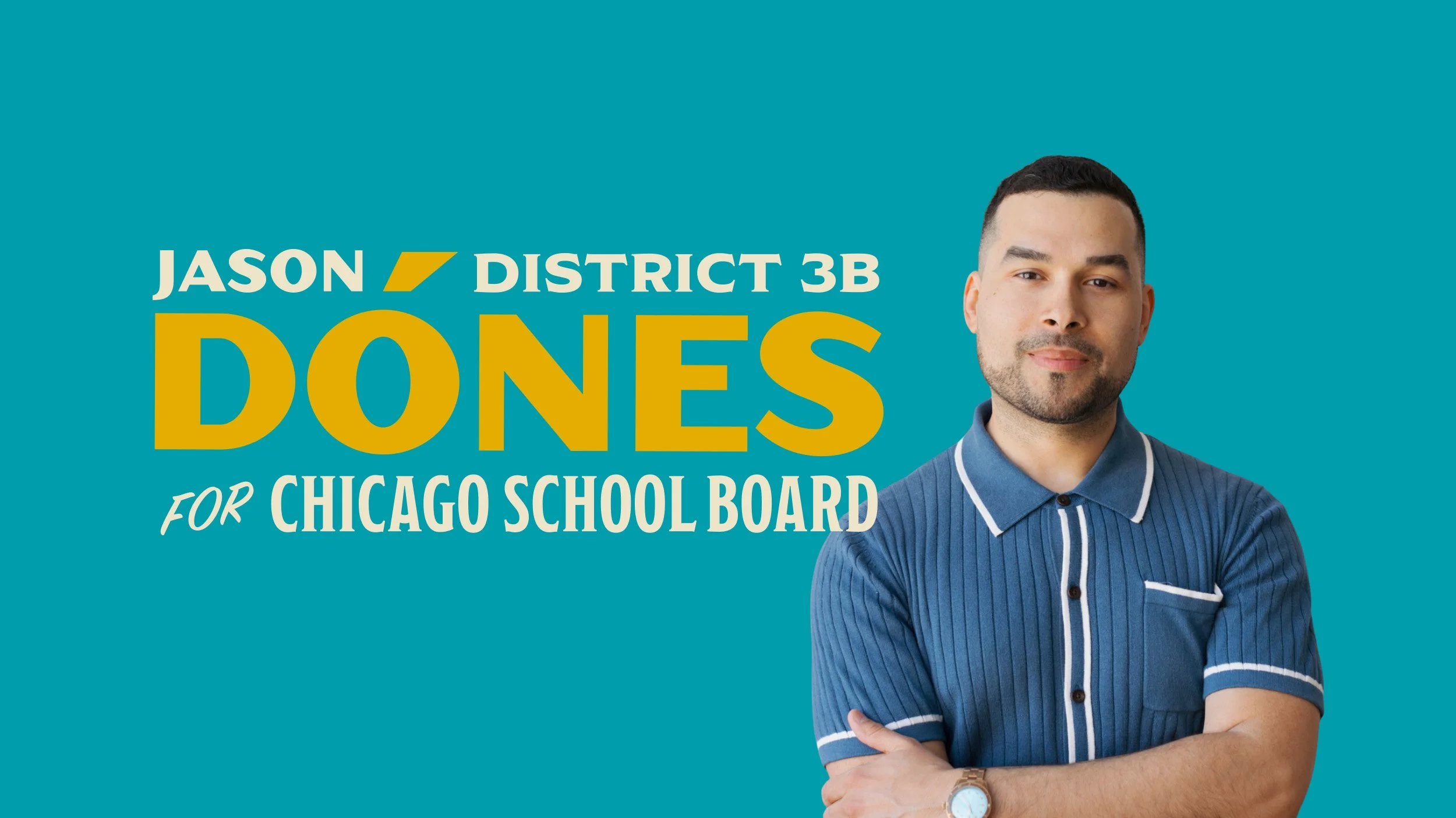
Jason Dónes / Chicago, IL / 2026Jason Dónes’ campaign needed a visual identity that matched his strengths as a candidate: Bold, imaginative, hopeful, proudly Puerto Rican and rooted in Chicago’s neighborhoods.
Summary
With Chicago’s first all-elected school board race approaching in November 2026, public school parent and community organizer, Jason Dónes, needed his campaign to stand out in a crowded field of other candidates (some backed by big money and well-funded super PACs).
Brand Direction
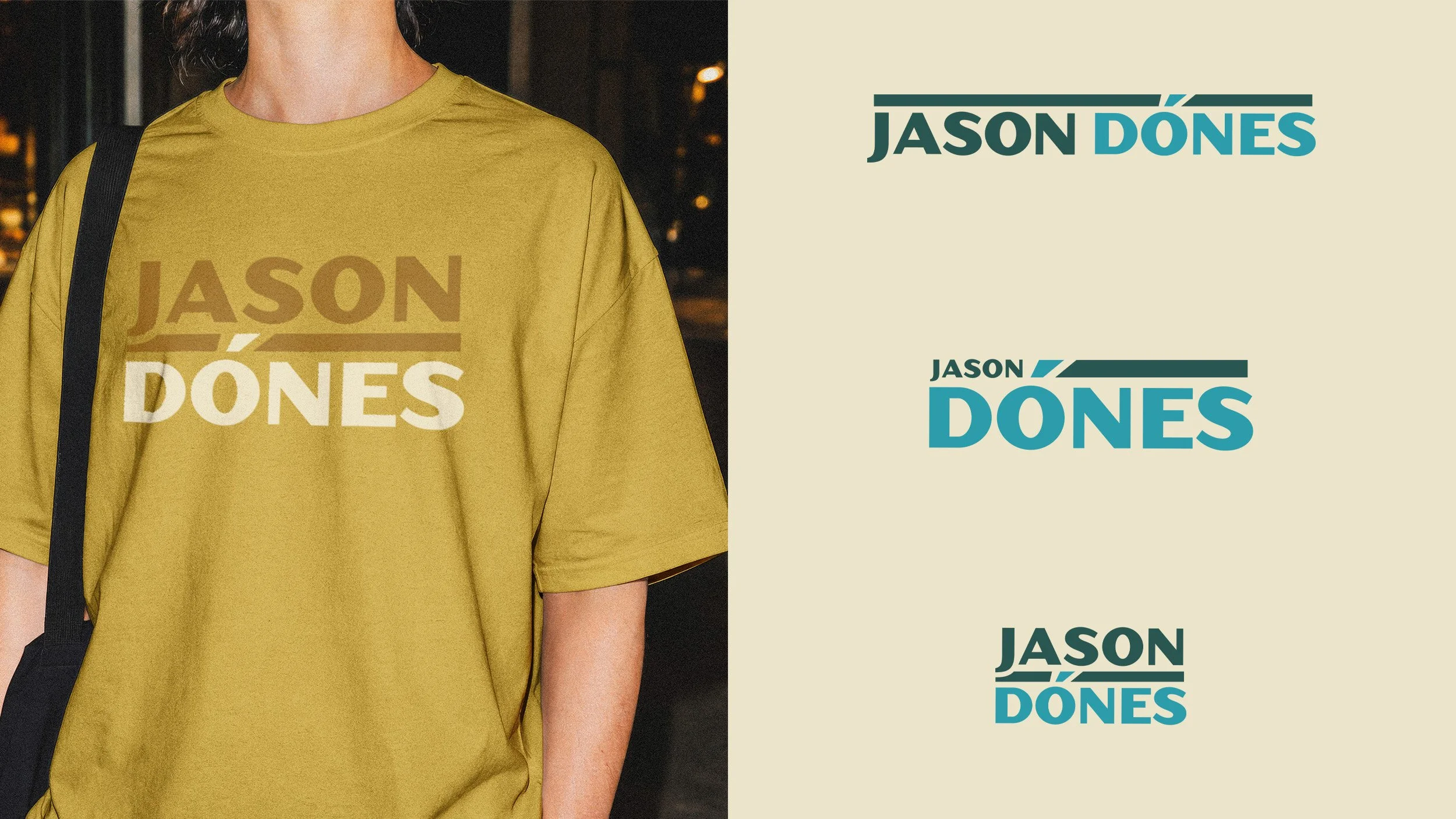
The brand direction for the identity captures and amplifies Jason’s Puerto Rican and Chicago roots. His last name includes the o-acute accent, which was intended to provide visual weight to bring attention to his name.
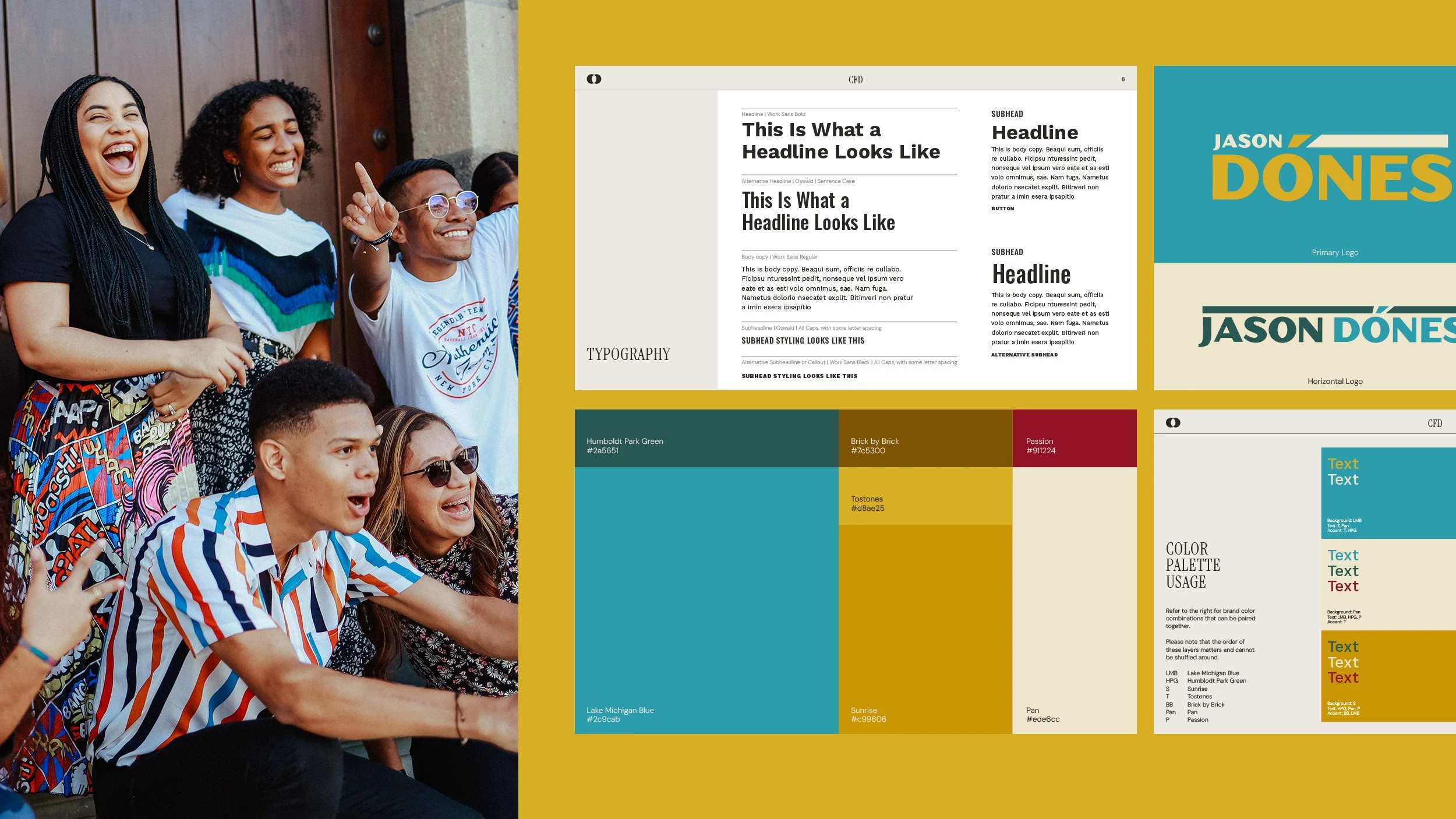
The color palette features a darker teal (Humboldt Park Green), light blue (Lake Michigan Blue) and red (Passion) from the Puerto Rican flag, and is complemented by a warm yellow (Tostones), inspired by fried plantains, a more commonly known Puerto Rican food.
Typography selected for the identity includes a mixture of styles including retro, hand lettering, and blunt serif styled fonts, which is a symbolism of time, unification, and intention to building something new while nodding to the past.
The typography and colors were a clear contrast to the typical “corporate” identities of most local candidates/campaigns — which played on Jason’s campaign promise to shake up the status quo as a grassroots school board candidate for the nation’s third largest school district.
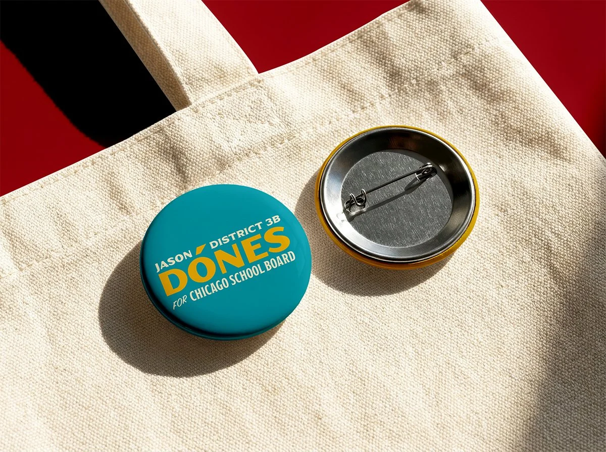
A brand kit was created to help empower a full volunteer team to create events, ads, flyers, social media posts, videos, website, and many more. With a tight deadline, the branding collateral came at a crucial time to empower Jason to fundraise for campaign staff, get on the ballot, and launch an energetic campaign.